
View sample Thematic Maps In Geography Research Paper. Browse other research paper examples and check the list of research paper topics for more inspiration. iResearchNet offers academic assignment help for students all over the world: writing from scratch, editing, proofreading, problem solving, from essays to dissertations, from humanities to STEM. We offer full confidentiality, safe payment, originality, and money-back guarantee. Secure your academic success with our risk-free services.
As the name implies, a ‘thematic map’ addresses a specific theme, such as health or climate. The theme can be narrowly focused, as for a map showing infant mortality rates for a specific year, or comparatively broad and complex, as for a map relating health-care delivery and mortality. In both function and content, thematic maps are fundamentally different from navigation maps, which serve the way-finding needs of drivers, pilots, sailors, and tourists, and general purpose or reference maps, which portray a diverse set of basic features such as coastlines, rivers, terrain, cities, transport routes, and political boundaries (Robinson and Petchenik 1976). Comparatively rare at the outset of the nineteenth century, thematic maps as a group have become more numerous, varied, and intellectually richer than either of these other two types (Robinson 1982). This research paper examines the distinctive elements of thematic maps, including principal strategies and pitfalls.
Academic Writing, Editing, Proofreading, And Problem Solving Services
Get 10% OFF with 24START discount code
1. Elements Of Thematic Mapping
Thematic maps have two main components: a thematic overlay, and a base map. Typically, the base map is already available in a cartographic database or collection of general-purpose maps, whereas the thematic overlay consists of data from a noncartographic source, such as field observations, a government census, or a thematic database. After selecting or specifying a base map with an appropriate geographic scope, map projection, scale, and reference features, the map author adds the graphic symbols and labels that portray the map’s unique theme, as shown in Fig. 1. Consisting largely of structural and background information, the base map is usually less visually prominent than the thematic overlay, which focuses on a specific distribution or relationship.
1.1 An Appropriate Map Projection Is Essential
Because the earth is spherical and most maps are flat, the base map distorts the geometry of boundaries and other reference features (Maling 1992). The amount of distortion depends in a large measure on the map’s ‘scale,’ defined as the ratio of distance on the map to distance on the earth. On a ‘large-scale’ map covering a neighborhood, an archeological excavation, or other small area for which the earth’s curvature is minimal, the distortion can be negligible. By contrast, a ‘small-scale’ map covering a continent, a hemisphere, or the entire world must distort large shapes as well as most distances and directions, and might also distort areas and angles. But by selecting an appropriate projection, the map author can avoid distortions likely to mislead readers.
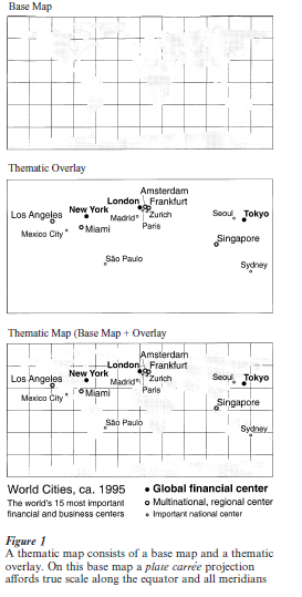
The world map in Fig. 1 illustrates the distortions of the ‘plate carree,’ or ‘plain chart,’ a map projection for which locations are easily reproduced on a sheet of graph paper. This particular perspective is ‘developed’ by shrinking the earth to a globe, and then projecting meridians, parallels, and other features onto a cylinder wrapped around the globe and tangent at the Equator. The globe establishes the projection’s ‘stated scale,’ which for most ‘cylindrical projections’ is valid only where the cylinder is in contact with the globe, in this case along the Equator. Distinctively the plate carree also provides true scale along all meridians, so that north–south scale is constant, and the parallels, like the meridians, are uniformly spaced. Because the meridians do not converge, as on a globe, the east–west scale grows progressively larger with increasing distance from the Equator, so that the map not only inflates the areas of Europe, North America, and other middle latitude regions, but also portrays Antarctica as twice the size of South America, which is appreciably larger. Even so, the projection offers a comparatively reliable portrait of Africa, which straddles the Equator.
Base maps with severely distorted areas can misrepresent seriously the extent and importance of thematic information (Monmonier 1993). For instance, the plate carree, if used for a map of fertility, automobile ownership, or other phenomenon with marked differences between mid-latitude and tropical countries, will overstate the incidence of patterns occurring in North America, Europe, and Australia, while underrepresenting patterns in Latin America, Africa, and southern Asia.
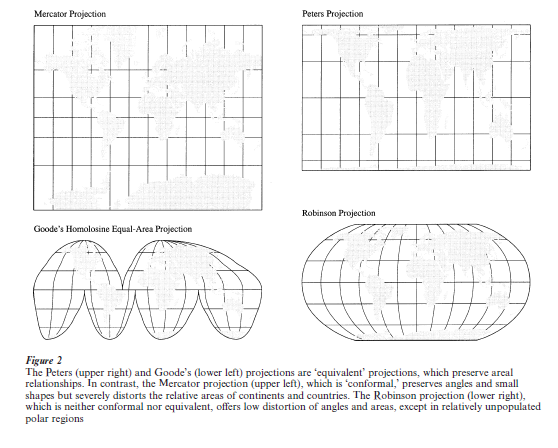
The Mercator projection (in the upper-left part of Fig. 2) fosters even more egregious areal distortions. Designed to render lines of constant direction as straight lines—sailors and pilots can plot a course as a straight line, and read its bearing with a protractor— the equatorially-centered Mercator projection increases the poleward separation of the parallels steadily so that Greenland looks as large as South America. Because the north–south scale increases to infinity at the poles, which are never shown, the grid in Fig. 2 is truncated at 80 N and 80 vs. (More potentially misleading versions of the projection show only half of Greenland and omit Antarctica altogether.)
Area distortion can be especially troublesome for a ‘dot-distribution map,’ on which equal-sized dots represent a fixed number of people, hogs, or hectares of wheat. On this type of map, closely spaced dots indicate a higher density than widely separated dots. An ccurate portrayal of relative density thus depends upon a base map with little or no areal distortion (Monmonier 1996). For example, if regions A and B, in different portions of the map, each contain a hundred evenly spaced dots within a square centimeter, viewers will assume their densities are similar. But on an inappropriate base map, this apparent similarity could be an artifact of the map’s projection: for example, if a globe shows region A, notably farther from the Equator, as only half the size of region B, the exaggerated relative size of region A on the map will have spread its dots farther apart and reduced the apparent density.
Map authors can avoid misleading impressions of density and relative importance by choosing an ‘equivalent’ projection, designed to preserve areal relation-ships. ‘Equivalency’ is one of several properties with which map projections avoid specific kinds of distortion (Snyder 1993). Although all map projections distort most distances, ‘equidistant’ projections show true distances along straight lines converging on a point at the center (often but not necessarily one of the poles). Although map projections distort most directions, an ‘azimuthal’ projection displays true relative bearings for all shortest-distance, ‘great-circle’ routes converging at its center. Although map projections typically distort angles, ‘conformal’ projections show true angles as well as true shape within very small neighborhoods of every point: a property useful on small-scale weather maps, where angles between fronts, equal-pressure lines, and wind arrows are especially important, and on large-scale topographic maps, which cover small areas in detail and need to minimize distortion of shape and distance. Unfortunately, ‘equivalency’ and ‘conformality’ are mutually exclusive. Moreover, equivalent projections distort shape severely on world maps, whereas conformal projections (such as the Mercator projection in Fig. 2) greatly distort area.
The other three projections in Fig. 2 illustrate the trade-offs confronting a map author who needs to choose a world base map for a thematic overlay. The Peters projection (upper-right part of Fig. 2) is one of many equivalent projections with a rectangular grid. Although touted by pro-Third World and human rights groups in the 1970s and 1980s (Crampton 1994), its distinctive combination of severe east–west stretching near the poles and marked north–south stretching near the Equator yields gaunt, noticeably distorted shapes for Latin America, Africa, and most tropical countries, but provides comparatively accurate renderings of the UK, Germany, and other countries closer to 45 N and vs. By contrast, Goode’s homolosine equal-area projection (lower-left part of Fig. 2) is a composite of 12 locally centered projections that interrupt the oceans in order to describe more accurately the shapes of continents and other land features. A distinctly different trade-off is apparent in the Robinson projection (lower-right part of Fig. 2), which is neither equivalent nor conformal. By tolerating small amounts of areal distortion, mostly near the poles, the Robinson map lessens the distortion of large shapes without interrupting the oceans.
1.2 Appropriate Visual Variables Are Also Essential
Verbal and graphic languages are complementary. Words in a thematic map’s title, key, and caption link the symbols to natural-language terms and concepts, and are no less important than the lines, ‘fill patterns,’ and other graphic marks representing features, categories, and data values. But because map readers are almost always more skilled in the conventions and vocabulary of verbal communication, the map’s effectiveness often hinges on its author’s understanding of fundamental graphic concepts, particularly the appropriate use of visual variables.
Jacques Bertin (1983), a French semiologist who proposed a formal theory of graphic language, recognized eight visual variables: the two ‘locational variables’ (X-Y coordinates) for describing position on the paper or computer screen, and six ‘retinal variables’ for portraying a feature’s character or category: size, shape, orientation, texture, hue, and value. Of the six, the latter three require clarification: ‘texture’ refers to the spacing of individual elements in a dashed line or set of parallel lines, ‘hue’ concerns readily apparent distinctions among blue, green, orange, red, and other named colors, and ‘value’ pertains to the relative lightness or darkness of a color or gray-tone. Although cartographers employ other retinal variables, such as numerousness, movement, and duration, Bertin’s original six account for most symbols on thematic maps (Dent 1999).
Whether a symbol is appropriate depends in part upon whether the data are qualitative or quantitative. For countries or neighborhoods, area symbols varying in hue can be most efficient for qualitative themes such as dominant religion, native tongue, or type of agriculture, whereas a light-to-dark sequence of graytones is generally more effective for quantitative differences, as on maps showing local proportions of dairy farms, Roman Catholics, or Francophones. On a map of language regions, for instance, red for English and blue for French underscore differences in kind by looking quite different, at least to viewers with normal color vision. By contrast, shades of gray rely on the ink-intensity metaphor whereby a gray-tone representing 51–65 percent, for example, is at least noticeably darker than a gray-tone representing 36–50 percent. Among the retinal variables, hue and shape are better suited for qualitative differences, while size and value are more appropriate for quantitative differences. Orientation is best reserved for showing differences in direction, as with flow lines on a traffic map (Szego 1987) or wind arrows on a weather map, while texture can reinforce or mimic value, as when closely spaced parallel lines make a fill pattern look darker than a similar symbol with more widely spaced lines.
Quantitative variables require a further distinction between count data and intensity data. Gross national product, tons of steel, and numbers of infant deaths are examples of count data: magnitudes represented most effectively by symbols varying in size so that bigger means more. By contrast, national income per capita, the percentage increase in steel production between 1990 and 2000, and the infant mortality rate are examples of intensity variables, better served by the darker-means-more metaphor of ordered graytones or single-hue colors.
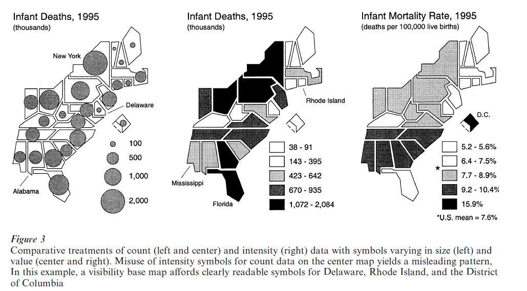
Figure 3 illustrates the need to distinguish between count and intensity data. All three maps address infant mortality in the eastern half of the USA. At the left, proportional circles describe differences in the number of infant deaths; a bigger circle unambiguously represents more infant deaths than a smaller circle. In the center, a gray-tone treatment of the same data yields a potentially misleading map with dark, ominous looking symbols for states with relatively large numbers of deaths and comparatively light symbols for states with few deaths. Stark differences in gray- tone thus suggest a health crisis in New York, Florida, and other relatively populous states, and comparatively benign conditions in moderately populous states like Alabama and Mississippi. By contrast, the graytones in the right-hand map offer a far more accurate portrait of geographic variations in the infant mortality rate, which adjusts infant deaths for the number of live births. On this last map, dark symbols for Alabama and Mississippi reflect two of the highest infant death rates in the nation, while New York and Florida register markedly lower (although moderately high) rates.
2. Principal Cartographic Strategies
Although thematic maps constitute a rich cartographic genre, any moderately conscientious examination of atlases, government publications, and scholarly books and articles will confirm the prevalence of a small number of graphic strategies, collectively appropriate for most needs. This section of the paper identifies the more common varieties and their primary uses.
Aside from location maps, which are more topographic rather than thematic, the most common thematic map is the ‘choropleth map,’ in which area symbols representing specific categories completely fill the boundaries of countries, provinces, census tracts, and other areal units. Although some choropleth maps are qualitative, most are quantitative, largely because censuses and other systematic surveys have generated enormous amounts of numerical data for areal units. As the rightmost map in Fig. 3 illustrates, quantitative choropleth maps require intensity data as well as a coherent, light-to-dark series of ordered gray-tones or colors with little, if any, variation in hue. A principal exception is the map showing rates of change, for which contrasting hues, such as red and blue, can distinguish efficiently increases from decreases, while a variation in value differentiates larger rates from smaller rates (Brewer 1997). Because different classifications of the data can yield radically different spatial patterns, the efficiency and effectiveness of a choropleth map depends heavily on its categories (Evans 1977). A wise practice, often ignored, is the use of inherently meaningful category breaks, such as zero on a map of migration rates, or the national mean on a map of per capita incomes by province (Monmonier 1993).
Other common symbols for displaying quantitative data include proportional circles (as in the left-hand map of Fig. 3), ‘pie charts’ (circles divided into sectors representing subcategories with different hues), and small, equal-sized dots. On a dot-distribution map, each dot represents the same amount, ideally chosen so that the dots barely coalesce in the most dense area. On transportation maps, line symbols describe routes or flows, line width reflects volume of traffic or relative importance, and hues distinguish among highways, railways, and pipelines.
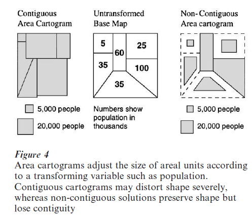
Some thematic maps demand specially tailored base maps (Southworth and Southworth 1982). For London, New York, and many smaller metropolitan areas, ‘linear cartograms’ of subway or bus systems represent individual routes with highly generalized lines varying in hue. By altering the map projection radically, linear cartograms afford greater detail in the central city, where routes converge and stops are closer. By contrast, on an ‘area cartogram’, the symbols representing countries or provinces vary in size according to population, wealth, military strength, or some other transforming variable. As Fig. 4 illustrates, contiguous area cartograms may require severe distortions of shape, whereas non-contiguous area cartograms sacrifice contiguity for shape (Olson 1976). In addition to dramatic demonstrations of international disparities in wealth or defense-spending, population cartograms provide a ‘demographic basemap’ useful for choropleth maps of public health and socioeconomic data (Dorling 1994). Adjusting the base map for differences in population diminishes the exaggerated impact of large units with small populations and ensures visible symbols for small, densely populated places. Another strategy, not based on population, is the ‘visibility base map’ (illustrated in Fig. 3), which merely provides readable symbols for small, otherwise obscure areal units.
Bibliography:
- Bertin J 1983 Semiology of Graphics: Diagrams, Networks, Maps. University of Wisconsin Press, Madison, WI
- Brewer C A 1997 Spectral schemes: Controversial color use on maps. Cartography and Geographic Information Systems 24: 203–20
- Crampton J 1994 Cartography’s defining moment: The Peters projection controversy, 1974–1990. Cartographica 31(4): 16–32
- Dent B D 1999 Cartography: Thematic Map Design, 5th edn. William C. Brown, Boston, MA
- Dorling D 1994 Cartograms for visualizing human geography. In: Hearnshaw H M, Unwin D J (eds.) Visualization in Geographical Information Systems. Wiley, Chichester, UK
- Evans I S 1977 The selection of class intervals. Transactions, Institute of British Geographers 2: 98–124
- Maling D H 1992 Coordinate Systems and Map Projections, 2nd edn. Pergamon Press, Oxford, UK
- Monmonier M 1993 Mapping It Out: Expository Cartography for the Humanities and Social Sciences. University of Chicago Press, Chicago
- Monmonier M 1996 How to Lie with Maps, 2nd edn. University of Chicago Press, Chicago
- Olson J M 1976 Noncontiguous area cartograms. The Professional Geographer 28: 371–80
- Robinson A H 1982 Early Thematic Mapping in the History of Cartography. University of Chicago Press, Chicago
- Robinson A H, Petchenik B B 1976 The Nature of Maps: Essays Toward Understanding Maps and Mapping. University of Chicago Press, Chicago
- Snyder J P 1993 Flattening the Earth: Two Thousand Years of Map Projections. University of Chicago Press, Chicago
- Southworth M, Southworth S 1982 Maps: A Visual Survey and Design Guide. Little, Brown, Boston, MA
- Szego J 1987 Human Cartography: Mapping the World of Man. Swedish Council for Building Research, Stockholm
ORDER HIGH QUALITY CUSTOM PAPER

Always on-time

Plagiarism-Free

100% Confidentiality